
Analytics software for sales, waste and purchasing
Turn the data your site produces every service into decisions. Sales and margins, waste and its causes, cost movements and stock value come together in dashboards your team can read at a glance.
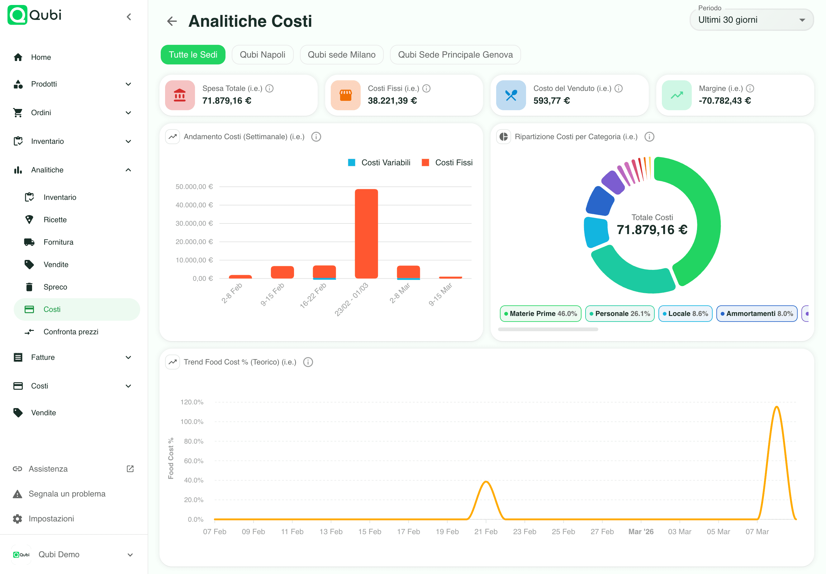
What you can analyse with Qubi
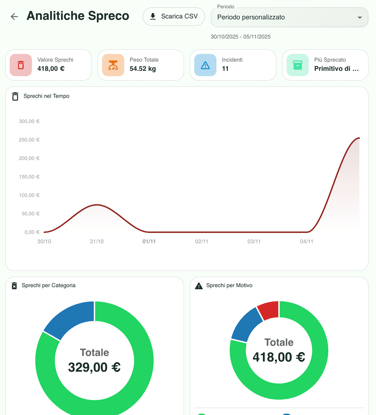
Waste
Waste incidents, the value you lost, the most wasted product and the reasons behind each write-off.
Sales
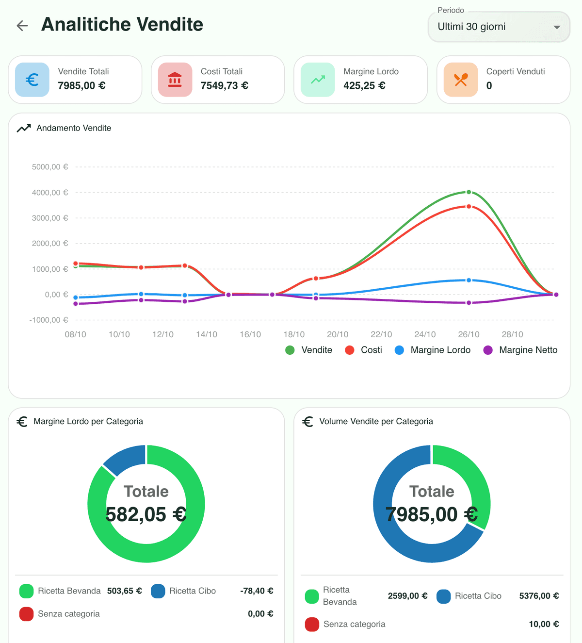
Gross margin, service revenue, total sales and how each period compares with the one before it.
Purchasing
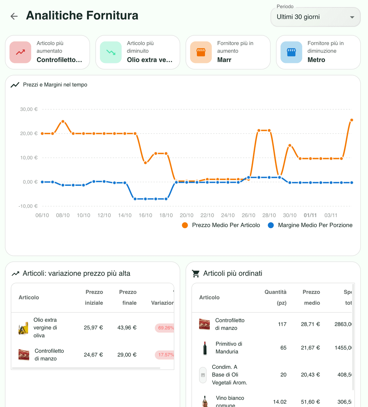
Items whose cost moved the most, average inflation over time and the average margin of every dish you sell.
Best and worst sellers
Ranking of the dishes that sell most and least, with margin broken down by category and subcategory.
Stock
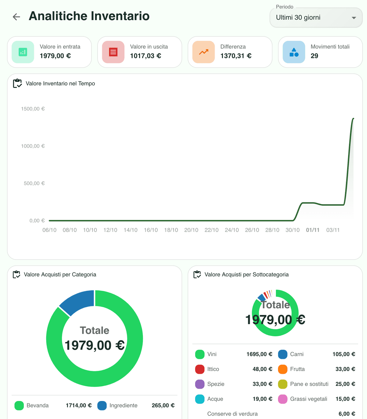
The products you buy most, spend aggregated by category and the value of your stock over time.
Price comparison
The same item across different suppliers, with pack sizes and terms lined up next to each other.
Waste analysis: incidents, value and causes
Follow how many write-offs happen, what they cost you, which product suffers most and why it happens, whether that is expiry dates, handling errors or damaged deliveries. You end up fixing a cause instead of chasing a number.
Gross margin, service revenue and total sales
See gross margin, service revenue, total sales and the trend for any period. Spot the categories that carry the business and the ones that only look busy, then adjust the menu and your pricing on solid ground.
Cost movements, inflation and average margin
Find the items whose cost has jumped, watch average inflation build up month after month and check the average margin of each dish you sell. Buying decisions stop being a feeling and start being a calculation.
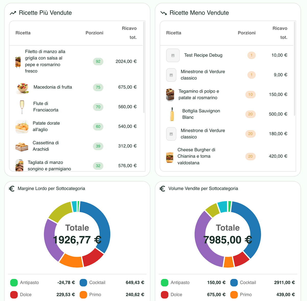
Best and worst sellers with margin by category
Explore what sells and what sits on the menu doing nothing, then read margin by category and subcategory. It is the fastest way to see where the offer earns its place and where it needs rethinking.
Purchases, spend by category and stock value
See the products you buy most, how spend splits across categories and subcategories, and how the value tied up in your stock moves over time. Full control over the money sitting on your shelves.
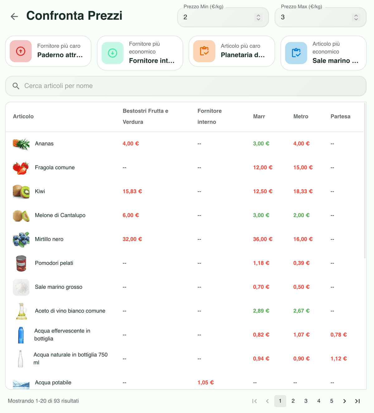
Supplier comparison per item, terms included
For each item, compare cost, commercial terms and pack sizes across the suppliers you work with. The cheapest option is easy to find, and easy to check against the quality standard you already set.
Restaurant analytics FAQ
Clear, actionable answers about every area Qubi measures for your business.
How is waste measured?
We track the number of incidents, the value lost, the most wasted product and the reason for each write-off, such as an expiry date, a handling error or damage on delivery. Reports show trends and the areas worth fixing first.
Which sales metrics do I get?
Gross margin, service revenue, total sales, average ticket, the best performing categories and the trend over any period, in charts and KPIs that refresh as new sales come in.
What do the purchasing analytics cover?
They surface the items whose cost has moved the most, calculate average inflation over time and measure the average margin of every dish sold, so buying decisions and menu pricing rest on real numbers.
Can I see the best and worst selling dishes?
Yes. You get a ranking of the dishes that sell most and least, with margin by category and subcategory, and you can filter by period to compare performance across weeks, months or seasons.
What can I learn about stock?
Which products absorb most of your spend, how that spend splits by category and subcategory, and how the value of your stock moves over time, so you know where to focus budget and controls.
How does price comparison work?
For every item you can compare price, terms and pack size across the suppliers you buy from, which makes it quick to spot the option that is genuinely cheaper rather than only cheaper on paper.